Making Components with shadcn
Originally published on 7/23/2023
Recently at work we’ve started using shadcn to build components for our frontend.
The shadcn/ui library is a collection of accessible and customizable components. It is free and open-source, and it is built using Radix UI and Tailwind CSS.
I like it because it is less of a dependency and more of a pattern for you to follow when building out your own UI library. As it says in their documentation:
“Pick the components you need. Copy and paste the code into your project and customize to your needs. The code is yours.”
In our case, we have a DatePicker component that uses react-dates which is an open source datepicker library, originally built by developers at Airbnb. The main issue I found with the library was that it didn't handle text entry very well, and it was not easy to debug exactly what was going on. Additionally, the project hadn't been updated since Jan 26, 2022.
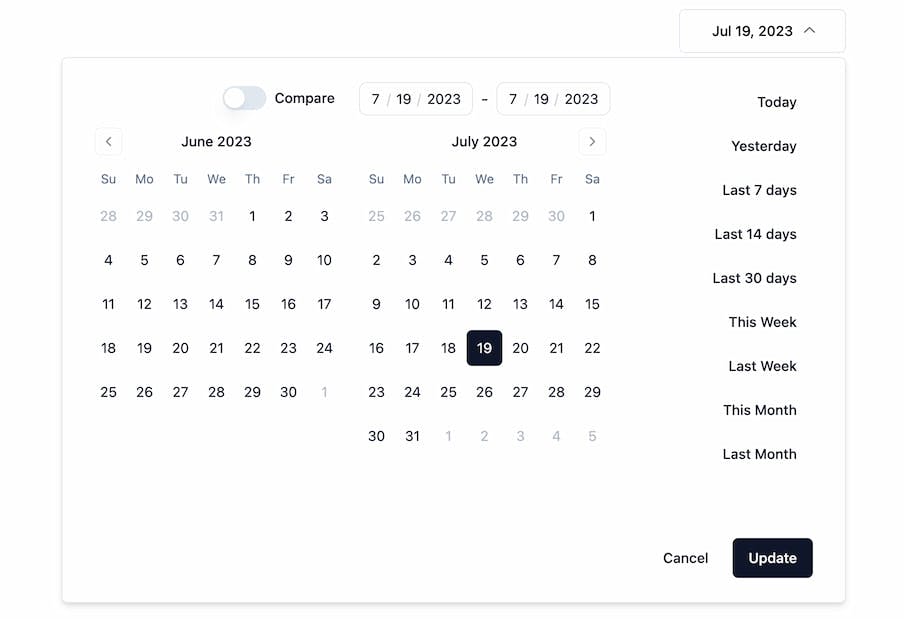
I was able to pretty quickly use various shadcn/radix components to compose a newer, better version of our old component. I also made an open source version of DateRangePicker and published it at github.com/johnpolacek/date-range-picker-for-shadcn.
Apparently there are a lot of shadcn fans out there looking for a date range pickers!